7 Tips for Creating User-Friendly Search Forms
October 24, 2011

If you are working with online database apps, chances are that you have already made or are thinking about creating a search form for users to quickly find the data they are looking for. We have gathered a short list of best practices that can make your search form much easier to use.
1. Keep It Simple
The smaller the search form, the fewer things the user has to think about and therefore the easier it is to use. Can you get away with just one field or a few fields? If some users need more advanced filtering options, you can set up a secondary “Advanced Search” interface and link to it.
 2. Short Labels
The less text you have on your search form, the easier it is on the eye. If you need to explain an option, do it below the field rather than on the label.
3. Defaults
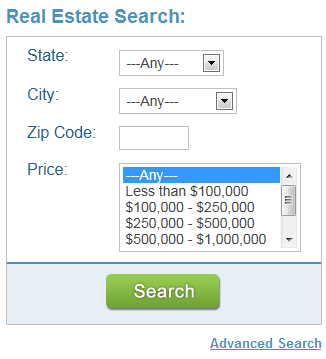
If at all possible, provide default values in your fields. For dropdowns, always include “All” or “Any” and make it the default.
4. Important Fields First
Organize your search form in such a way that the fields most people use are at the top and the less frequently-used fields are at the bottom of the form.
5. Leave No Ambiguity
Are any of your search fields vague or unclear? For example, if you have a set of “From/To” date fields, is it clear whether search results are inclusive or exclusive of the date values? A small textual tip could make it clearer.
6. Avoid Long Dropdowns
You may have little choice on this, but to the extent possible try to keep dropdown choices below 10The upcoming release of Caspio 7.2 includes a new form element called AutoComplete offering a great alternative to heavy dropdowns. It works similar to a Google search box where as the user types search keywords, a matching selection of choices are shown from the associated lookup table.
7. Ask for Feedback
Give your users the ability to share their improvement ideas with you. Provide a link to a feedback form on your page.
Usability is part science and part art; however it is highly dependent on the audience that your app serves. The general public has a completely different standard for usability than a team of research scientists.
What usability gems do you follow?


