Tech Tip: How to Create Responsive Web Apps Using Caspio
November 21, 2014

Responsive design is one of the most popular web design techniques to address the growing number of tablet and mobile devices accessing the web today. It aims to create pages that automatically adapt to various devices with different screen sizes and browsers. Making your pages responsive not only provides an optimal viewing experience, it also greatly improves the usability of interactive functionality such as menu navigation, registration forms, and other web apps.
At Caspio, we have received an increasing amount of inquiries from customers looking to make their web apps responsive. So we created a Tech Tip to help customers incorporate responsive design into Caspio DataPages until this feature is fully-implemented in the product.
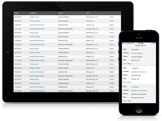
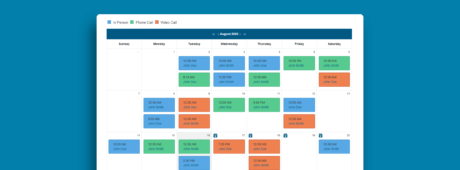
In the Tech Tip you’ll find step-by-step instructions to turn standard DataPages into Responsive DataPages, which include forms, tabular reports, gallery reports, and calendars. We’ve also provided a few interactive examples in the Tech Tip to show you the end results.
Try it out and let us know what you think. If you don’t have a Caspio account yet, sign up for a free trial and get started today.


